
Book Cover Trends
Things I learned about book cover trends from designing print ads
by Cynthia ToneyLet me say right away that I don’t design book covers. I’d rather write young adult novels. But like any fiction reader, I’m attracted to certain book covers more than others.
After receiving positive feedback regarding the first two covers of my YA series, I began to pay close attention to YA covers I liked. That led me to consider trends, and that led me to figuring out what made them work in attracting my attention.
In deciphering which features draw me to a book cover, I realized they’re the same features that designers of print advertising, known as display ads, employ in their designs. And I used to be one—a display ad designer, not an ad.
Everyone reading this knows that any two-dimensional design must stand on its own merit. It must please the eye regarding use of light, color, movement, balance, unity, and visual texture, to name a few elements of design.
An advertising designer also knows that the ad must somehow jump out at the reader from all the other ads on a newspaper or magazine spread or page. Readers of print periodicals make a decision in a split second whether or not to read an ad’s content. The same goes for a book cover, and thus for a book.
On a table or shelf, what can be done to make a book cover stand out among the rest? It has to do with knowing the trends and staying ahead of them if you can.
Going forward on memory alone—and it’s been eighteen years since I designed newspaper ads—here are some of the design trends I recognize from those days and see repeated in book covers today.
Eyes.
Big human eyes. Dog or puppy eyes. Snake eyes. Just about any eyes, with or without much of the face. The reader is captivated unless every book on the shelf uses eyes.


Off with their heads
—or one side or top or bottom half of the body. The brain fills in the missing pieces. This trend focuses the reader on what the body is doing or wearing and can give a strong hint about the story. Using only legs can work as well.


The back
--of a figure or the back of a head. Done right, it directs the reader into the figure’s point of view.


Human silhouette.
It evokes mystery. Unfortunately, newspaper advertisers often wanted to fill silhouettes with ad copy, to the dismay of the designer.

Symmetry, sometimes with Abstract Graphics.
Like many trends, the pendulum has swung from one extreme to the other when it comes to symmetry. For a time, YA book covers celebrated asymmetry. Symmetry was considered boring or lacking in style or design. Not so any more, judging from covers of new releases. Symmetry can be subtle, such as centering from left to right one or more objects or figures on an otherwise asymmetrical background. Abstract graphics might replace more realistic, photographic images.

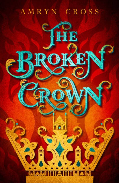

Limited Color.
At one time, all newspaper ads printed in black ink, and the product images attracted readers. Then spot color was introduced to draw the eye to an ad, but eventually most advertisers caught on and used it. When presses made full color printing available, a few big-budget advertisers were able to dominate the pages through size and color. Then the little guys followed suit, the pages filled with color and, once again, no one’s ad stood out. So, some clever advertisers went back to black to get their ads noticed on colorful pages.
Today, book covers appear to be moving away from full color and toward a limited color palette. What sometimes appears to be two or more colors is actually a duotone created with one color plus black. Sometimes the entire background is white.


Lens flare or spotlight treatment.
Brings light to an otherwise dark cover image, or calls attention to a particular area of it.


Large Title or Large Author Name.
This trend was addressed continuously in newspaper ads as “Large Header or Large Company Logo,” so it was more of an ongoing debate between designers and clients than a trend. Sometimes the company logo was the header, just as the author name can appear large at the top of a book cover. Or the title might appear much larger than the author’s name and be located at the top or bottom.


Playing with the Title Presentation or Font.
Other trends include a title that fills the majority of a blurry background, such as the cover of We Were Liars. Sometimes extra kerning (space) is added between letters to spread them out. Another trend is to place the title text on slips of paper, such as on the cover for All the Bright Places. As in that case, a human image might not appear on the cover at all.
I first noticed all these trends in advertising almost two decades ago, but they work now as they worked then.
By paying attention to the cover trends in our genres, authors can plan for our next book cover. The question is whether to ride a successful current trend—or create our own.
What is a favorite recent book cover and why? Did the cover call to you from among many others surrounding it?
~~~~~
Author Bio:
Cynthia writes character-driven teen novels with twisty plots—because life is complicated.
The first edition of her debut novel, Bird Face, won a 2014 Moonbeam Children’s Book Award in the Pre-teen Fiction Mature Issues category. With a new publisher, Write Integrity Press, the original story is now book one of the Bird Face series and titled 8 Notes to a Nobody. Book two is 10 Steps to Girlfriend Status. Watch for future titles in the series, which will continue to combine mystery, real-life struggles, and innocent teen romance.

Best ways to reach Cynthia:
Facebook Author Page: https://www.facebook.com/birdfacewendy
Twitter: @CynthiaTToney

Very interesting. Cynthia, thank you for lining this out because it is important that we make sense of what we see that is working.
ReplyDeleteThank you, Anthea. Often we know what we like, what works for us as a reader/consumer, but if we want to repeat that in our own cover, we need to dissect the elements.
DeleteGreat, Cynthia. I found this fascinating! Thank you for featuring Just Claire's cover. :)) Now I know why it works and why people comment on it.
ReplyDeleteThank you, Jean. Isn't it cool to see other covers using the same technique(s) as yours together like that?
DeleteThis is a good discussion on the important issue of cover design. Thanks, too, for including my new cover for Mardan's Mark in your post.
ReplyDeleteYou're welcome, Kathrese. Glad you enjoyed the post, and I love your new cover.
ReplyDeleteThanks, Cynthia. It was so interesting to see all of these wonderful covers!
ReplyDeleteThank you for commenting, Kristen! I enjoyed bringing these covers together all in one place.
ReplyDeleteThis was great information, Cynthia. Thanks for sharing!
ReplyDeleteElizabeth, thanks for commenting! I'm glad you enjoyed the post.
Delete