
Evolution of an Indie Cover
by Nancy Kimball


As authors, we make decisions about our books and careers
with the best information available to us at the time. Recently, I’ve been
thinking a lot about cover design and I wanted to share some of my thoughts
with you.
- A bad cover design is one
that doesn’t appear professional, and fails to communicate genre and tone
in less than three seconds.
- If you self-publish,
choose your cover carefully. A great cover is the foundation of your
marketing campaign.
- If you are signed by a
large publishing house, cover design is not nearly as important for you.
Legacy publishers have proven practices, design firms, photographers, etc.
and marketing departments who have already done and understand the nuances
of cover design as product packaging, no more, no less.
- If you go with a small
press, see if their past covers meet your own standard of quality. If you
are considering Indie or small press, it is VERY important for you,
because not every Indie or small press has the time, financial resources,
and experience available to do what the legacy publishers do.
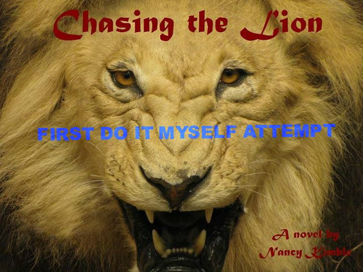
For posterity, though I would rather put a cigarette out in
my eye than make these public now, LOL, here is my very first homemade cover
for Chasing the Lion in 2011. Yes, I have watermarked them with blue text because
eventually they’ll show up in Google returns and while I hate that, clearly
visuals are powerful, so here they are.
I call the one above a hot mess now. First, you can’t tell
if it’s fiction of non-fiction just by looking at it and in thumbnail, the title
and author info are non-existent. It doesn’t look anything like a book cover.
But at the time, I thought it was the coolest thing ever and it fueled my
creativity and gave me courage to keep writing, so EVERYTHING you create has
value. It’s just not always where you want to stop.
This attempt was a step in the right direction, because now
it’s at least possible to get a sense of where this story/book is, but we were
still a LONG WAY from conveying genre.
Honestly, if I had stopped here, I would have been okay.
Because at the time it was what I could afford (the stock photo) and the best I
could do myself. If that had been the right time to self-publish my book, the
story inside would have still been the same. I would know I’d done the best I could
with what I had available to me in times and resources, and put the book out
there. However, I did not stop there, because I found over time I used the
cover to decide which books I would buy and read. And I got to where I could
tell if it was Indie, Christian fiction, or general market fiction, just by the
cover. I found for the most part, with few exceptions, cover was an indicator
of what I would find if I got to the blurb, and then sampled the beginning at
Amazon.
For my debut release, Alexandre my cover designer sent me
two concepts, both based on what I’d asked for: warm colors, and emotionally
evocative images in a unified design that would form the foundation for the
series. These were the first two concepts.
Concept two is still my favorite, although it wasn’t the one
I used. It captured the romance, showed my hero’s warrior side, and almost made
me cry. Concept one was the cover designer’s preference based on what he
thought would work best for the book. When I took both concepts to my core
readers and influencers, and total strangers, I found some very interesting
things in “product testing.”
- With cover two, people
thought it was a romance (which it is not, even though it has a strong
romantic element). Romance readers have very defined reader expectations
and Lion would miss on most counts for them, resulting in unfavorable
reviews and buyer’s remorse.
- With cover two, most
people unfamiliar with the story failed to recognize that the man with the
sword was the same man with his arms around the heroine. They thought one
was the hero and the other the villain.
- The first cover pulled a
general “some kind of gladiator story” with follow-ups as far flung as the
girl in the cover being a villain and others that he had to fight to
protect her. So this one was at least closer to where we needed to be.
- The wrist guard in the sword-raised
pose (look closely) was being mistaken for a wristwatch. People couldn’t
understand why he was wearing a watch (which he wasn’t, LOL) but this was
one of those very telling little cover-snob details that I’m so glad we
caught before release.
- The page curling detail in
the upper right was more a distraction than an enhancement.
- Some felt the hero on
cover one looked fake: too posed, and not emotionally evocative.
My amazingly gifted designer came back with these after
sharing our feedback and requested revisions. I chose that sword raised pose as
the dominant image because it was the most emotionally evocative of what we had
available.
Round two of feedback and testing the cover on new “fresh
eyes” of people who knew nothing about the story. We found that we were getting
closer to a more consistent and accurate ‘what is this book about’ from those
people. But there was still trouble and I wasn’t quite “there” with the
response I wanted to see from people viewing the cover for the first time.
- In the image with the
embrace, people STILL didn’t recognize it was the same man. I finally gave
up and new my absolute favorite image just wasn’t going to get the job
done.
- The middle one above was
my favorite out of these three, but people thought the woman appeared
weak, too soft, and the emotional contrast was too jarring. It was giving
cold viewers trouble figuring out what her relationship was to the man
with the sword. So that one wasn’t working either.
- The one on the right was
doing the best out of the three. Best for what I wanted it to do and the
response I wanted out of a person seeing it for the first time.
And then, a God thing happened. I was sitting in the waiting
room of the hospital with my brother (my photographer and a graphic designer
himself) and we were talking about why cover three would be best, and I got a
crazy idea. On the screen of my Kindle I put my thumb over the heroine, and
there it was. The cover that was right for Chasing the Lion. I took a deep
breath, because of the implications of what I was even considering: removing a
character from the cover who is integral to the story and the model who is a
good friend.
I asked Alexandre to send me one more design with just
Jonathan. This is it, and it became the final design.
I’d like to close with this with a final thought. Like our
stories, our paths are going to be and look different. I think the value in
sharing our experiences, and the options, promotes awareness for everyone to be
able to appreciate the craft and nuances of cover design. I still hope that one
day I’ll get to have all this done for me on a big traditional publisher’s
nickel. But until then, I’m going to keep writing, sharing my passion for cover
design, and working hard to be a successful author. And since honesty is both
my strong suit and my weakness… continue to judge books by their covers.

Comments
Post a Comment